Concord Kitchen & Bar
Branding / Concord Kitchen & Bar
A new identity for a local favourite.
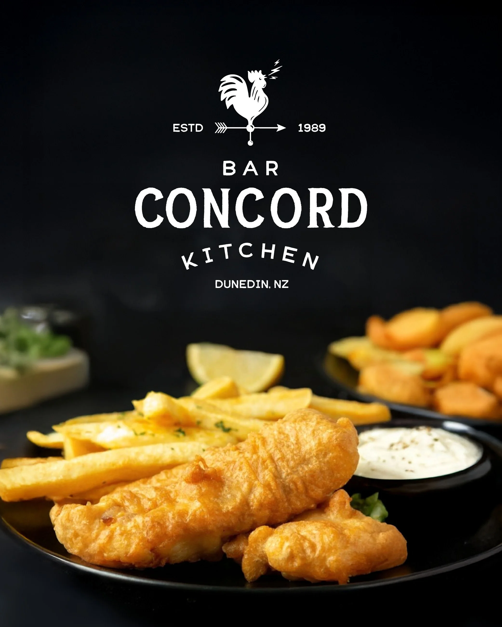
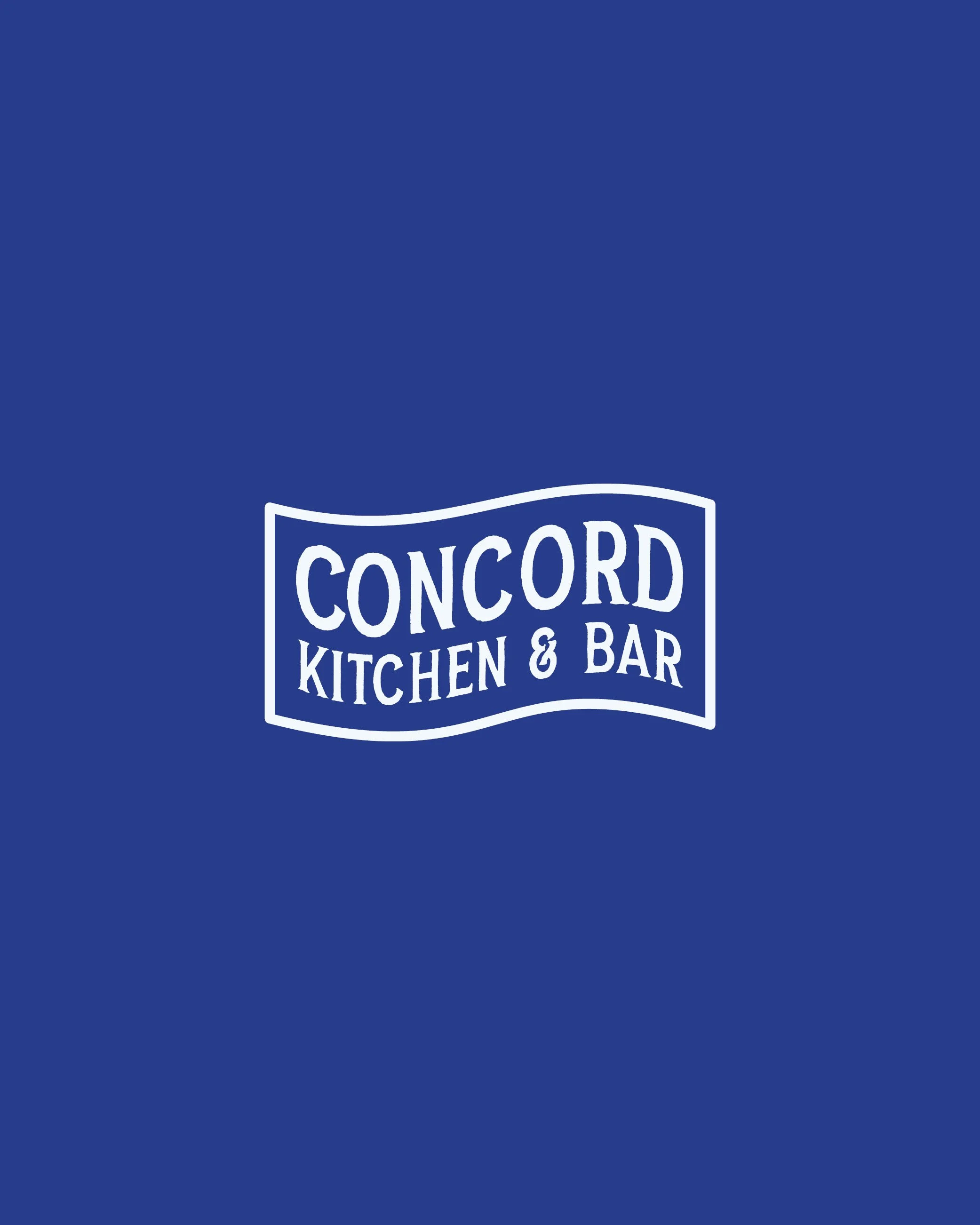
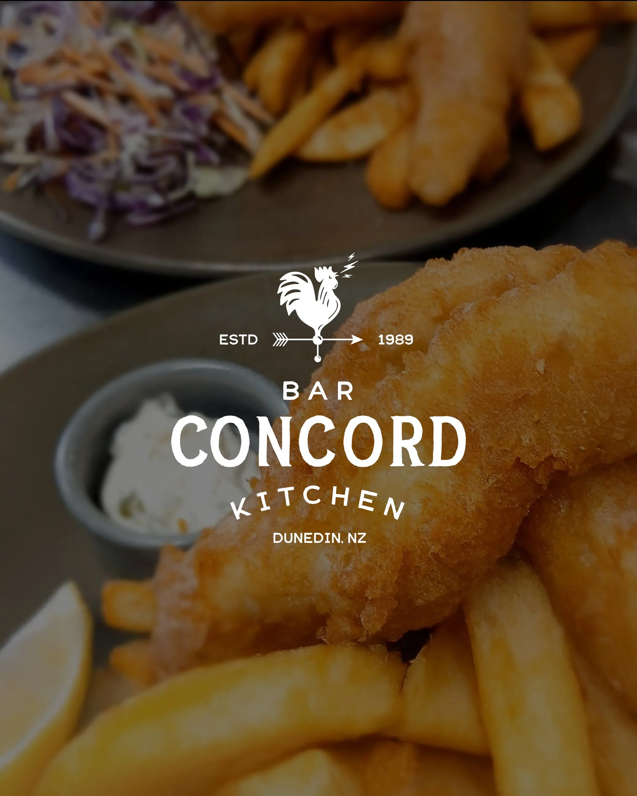
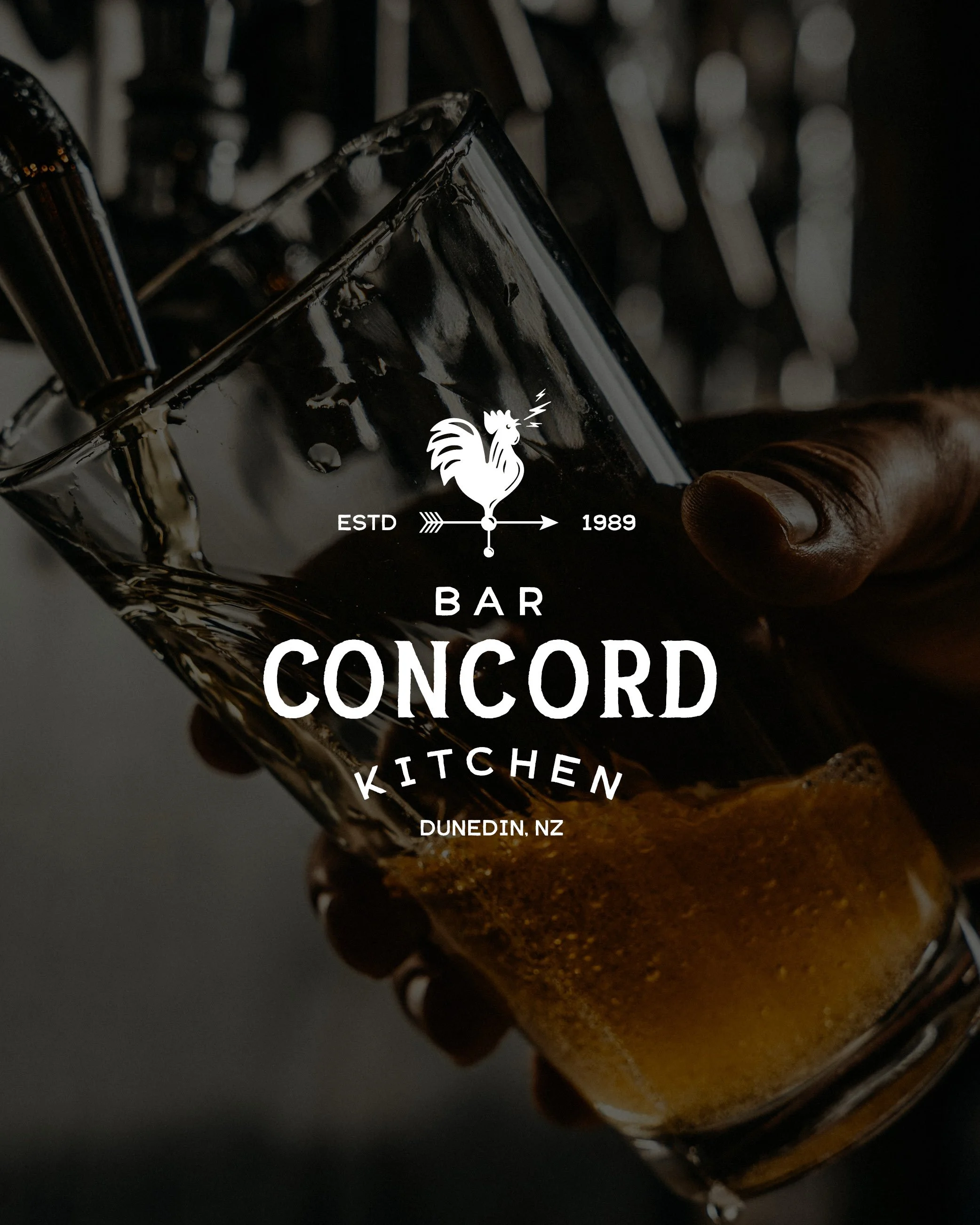
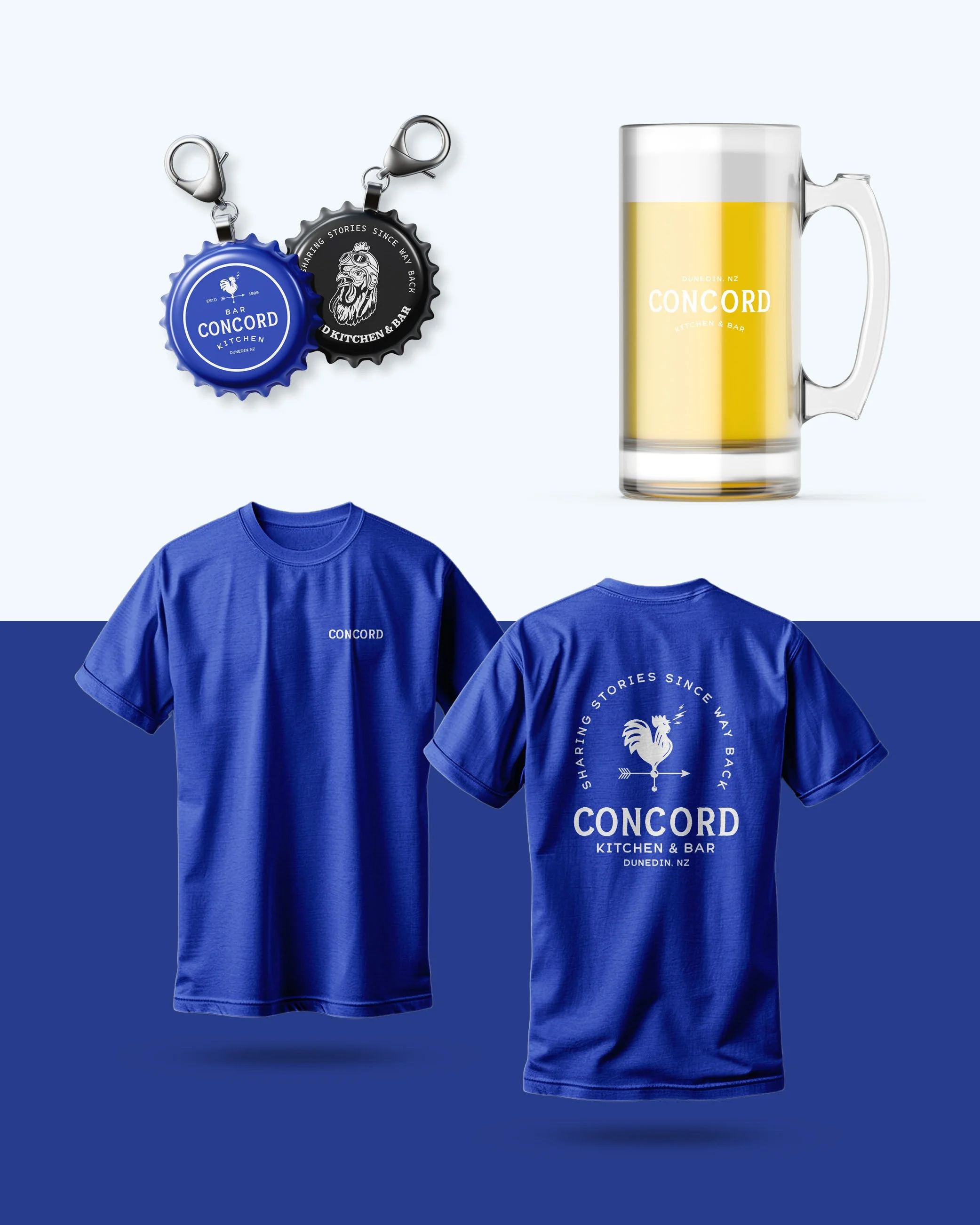
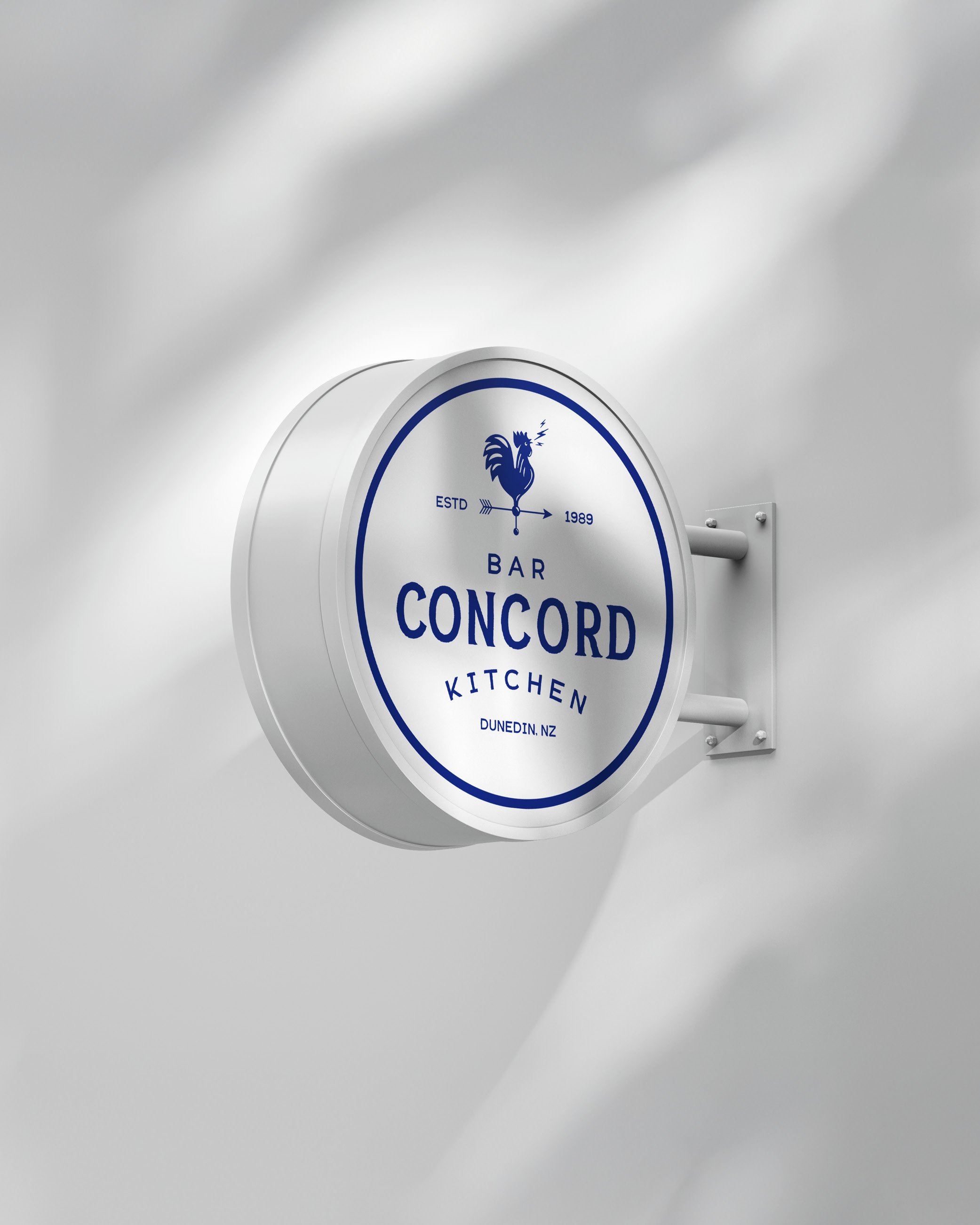
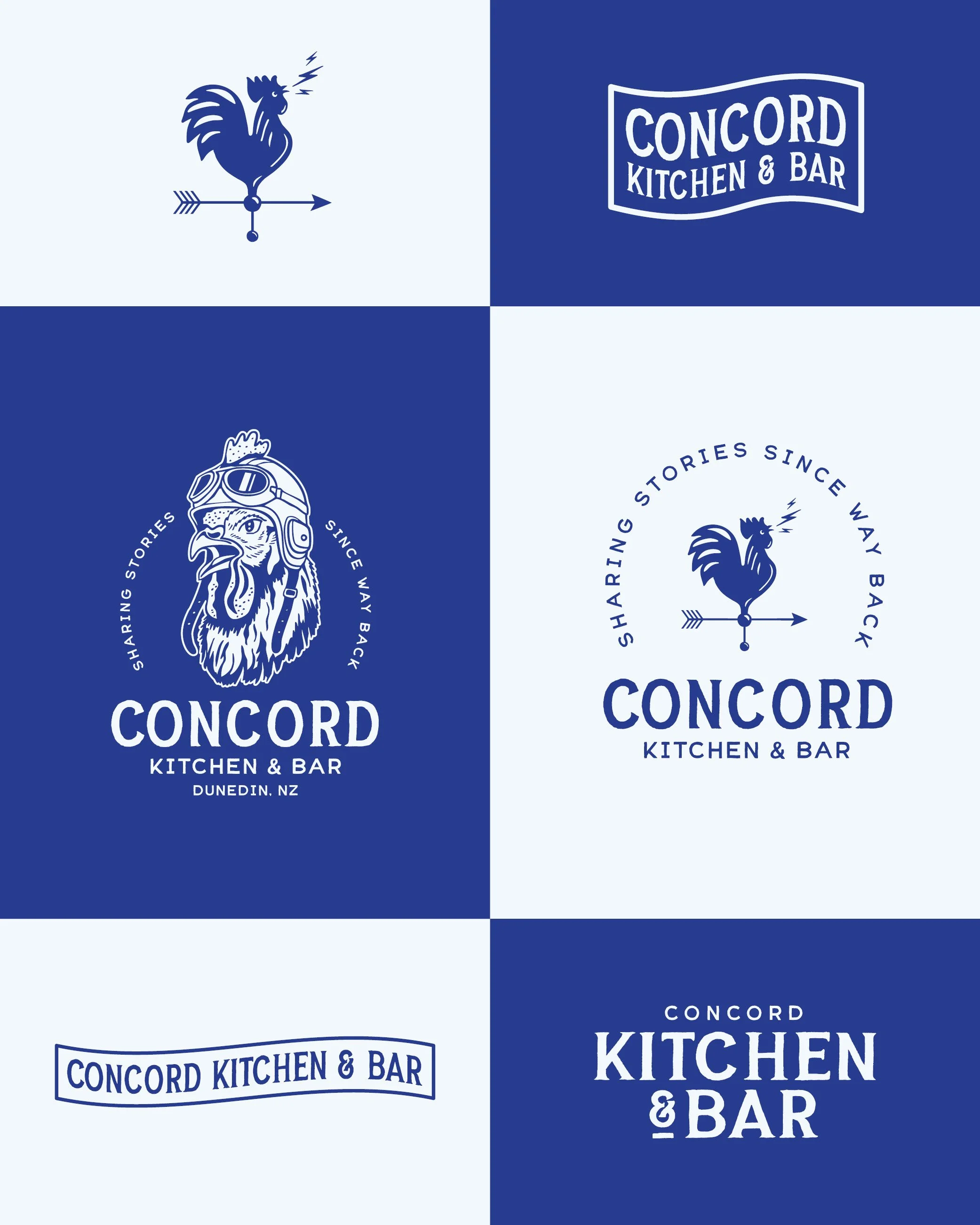
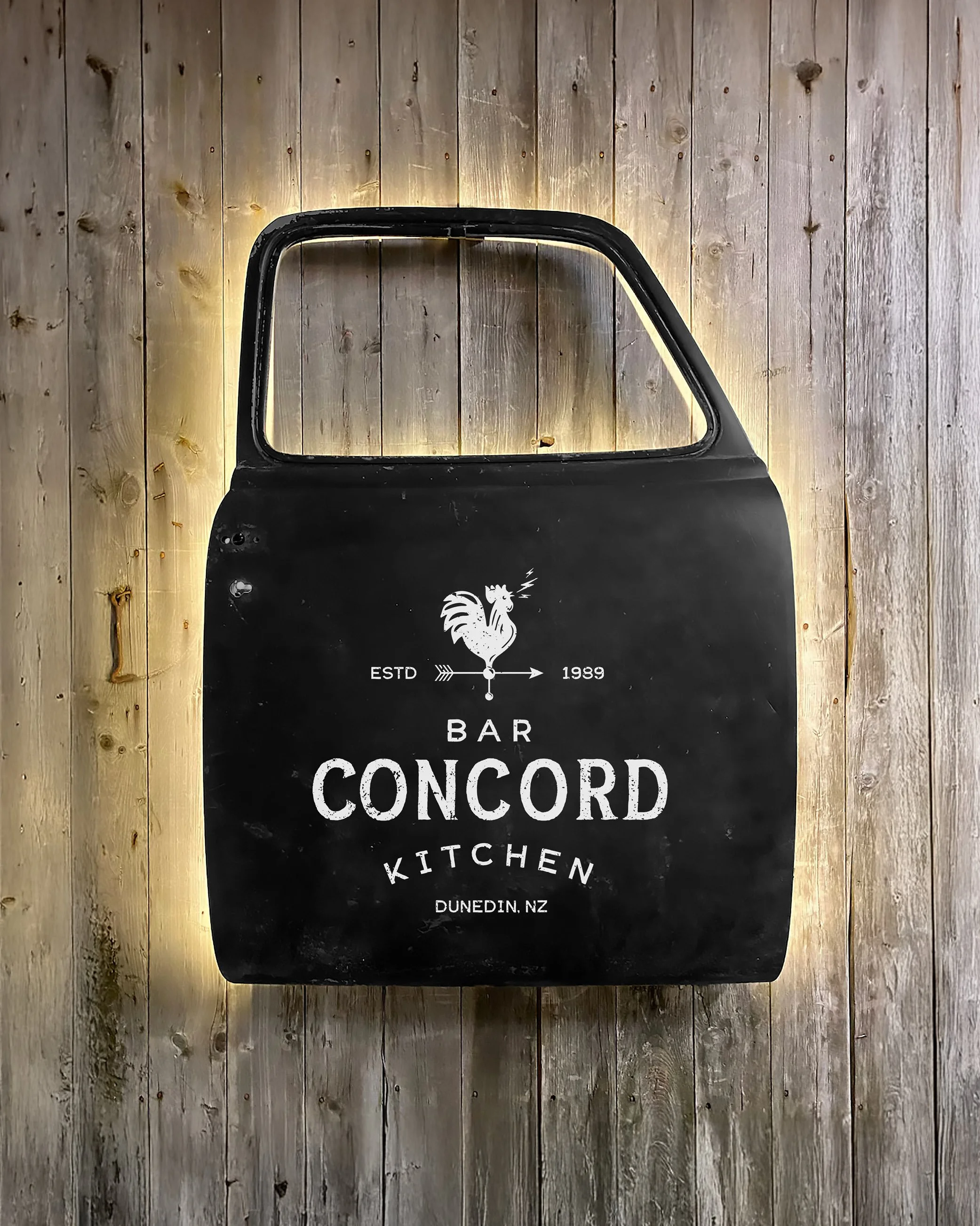
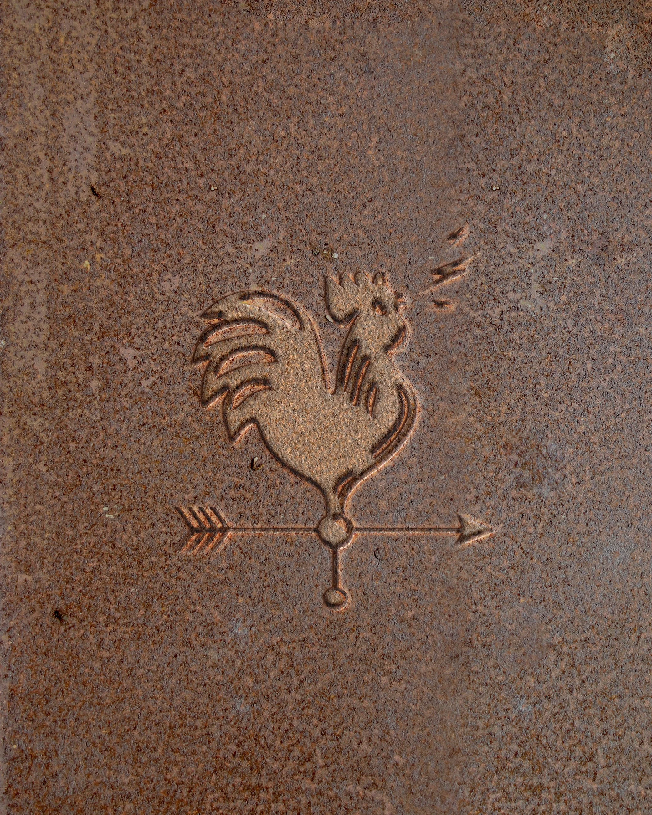
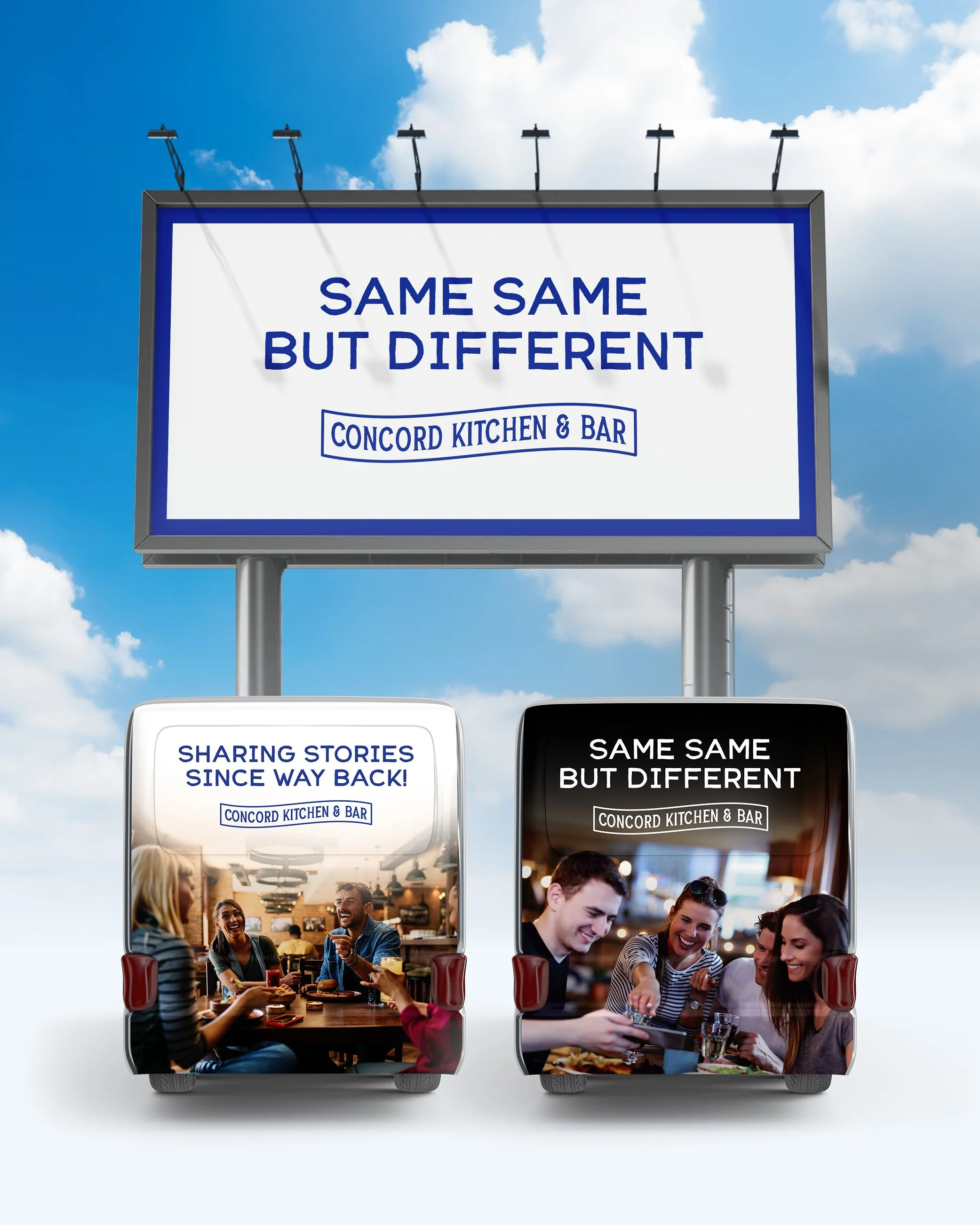
Jane and Wal wanted to move the Concord Inn forward without losing what made it special. The brief was to lift the brand to match the scale of the renovations and the direction they were heading. The identity is built around the original weather vane. A rooster with attitude, movement and energy. A bold blue leads the palette, supported by strong black and white foundations. The rollout includes illuminated signage, internal graphics, menus, stationery and merchandise, with more to come. One standout is the custom pylon sign set into a restored 1956 Ford Mainline ute. Keep an eye out for this in the new year.
Finished with a metal rooster riding a motorbike above the entrance, now part of the wider brand and merchandise range. Rustic, bold and unapologetically them. A classic New Zealand pub, reintroduced.