Horne Developments
Branding / Horne Developments
This project was built around the fundamentals of property development, strength, structure, and solid foundations. The identity takes cues from the materials and process behind every build, creating a brand that feels grounded, confident, and true to the industry. The logomark draws from wire mesh reinforcement used in concrete foundations, representing the unseen structure that supports everything above. Paired with a custom wordmark formed from clean lines and strong angles, the identity reflects precision, durability, and a straightforward approach to building..
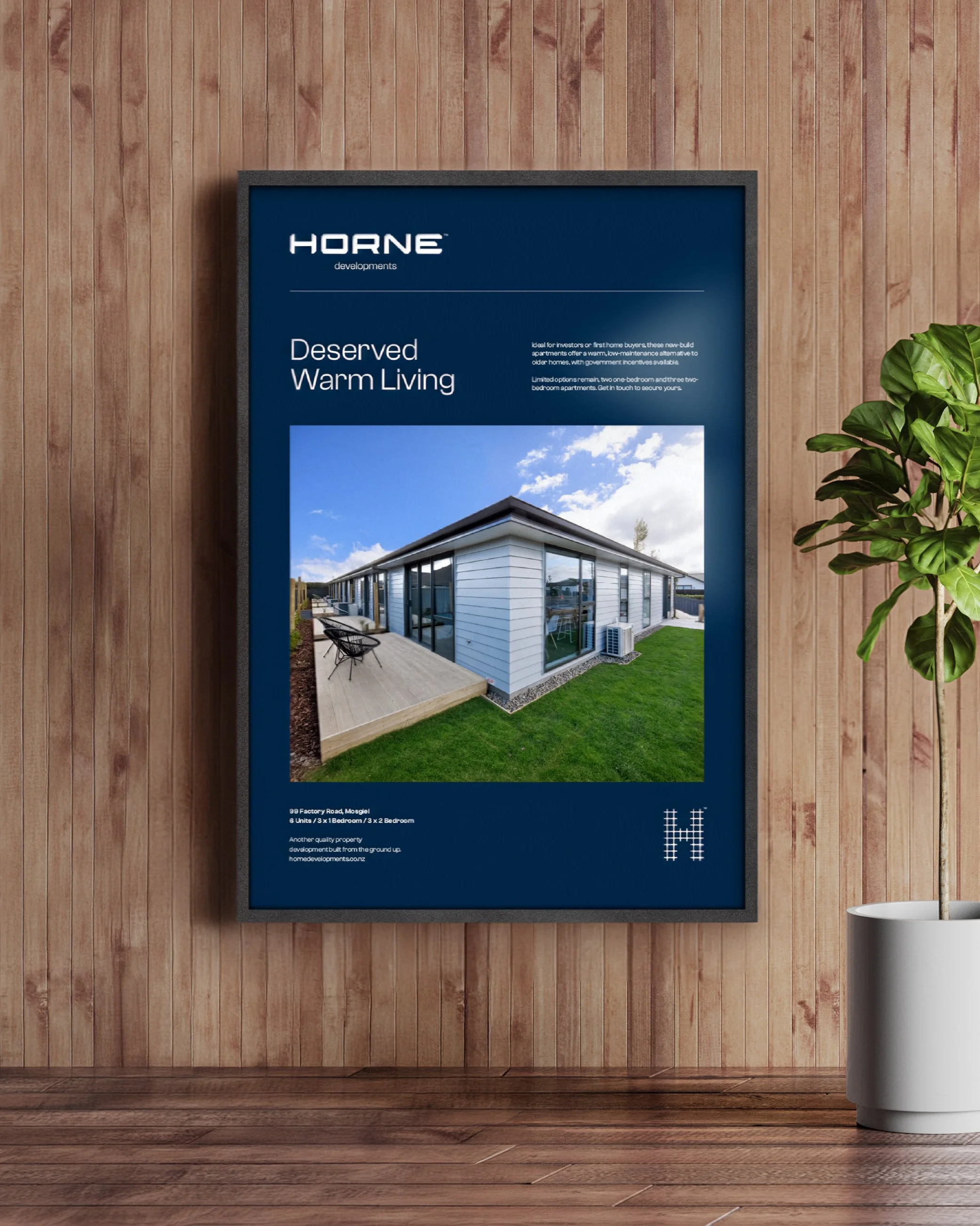
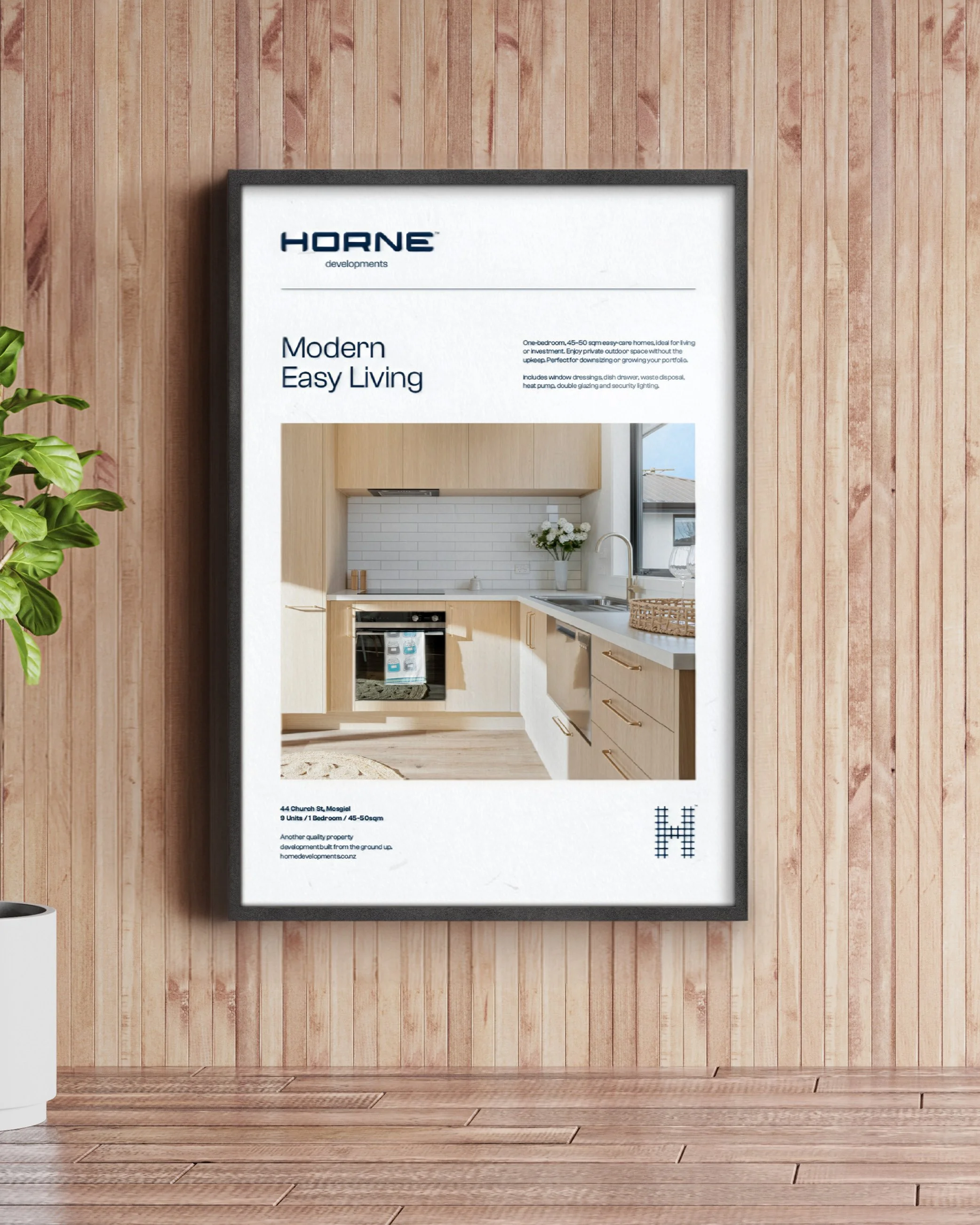
The project extended across a full brand rollout, including business stationery and pens, site signage and fence wraps, and a new website designed to showcase past and current developments.
See more at hornedevelopments.co.nz